BI Financial Dashboard
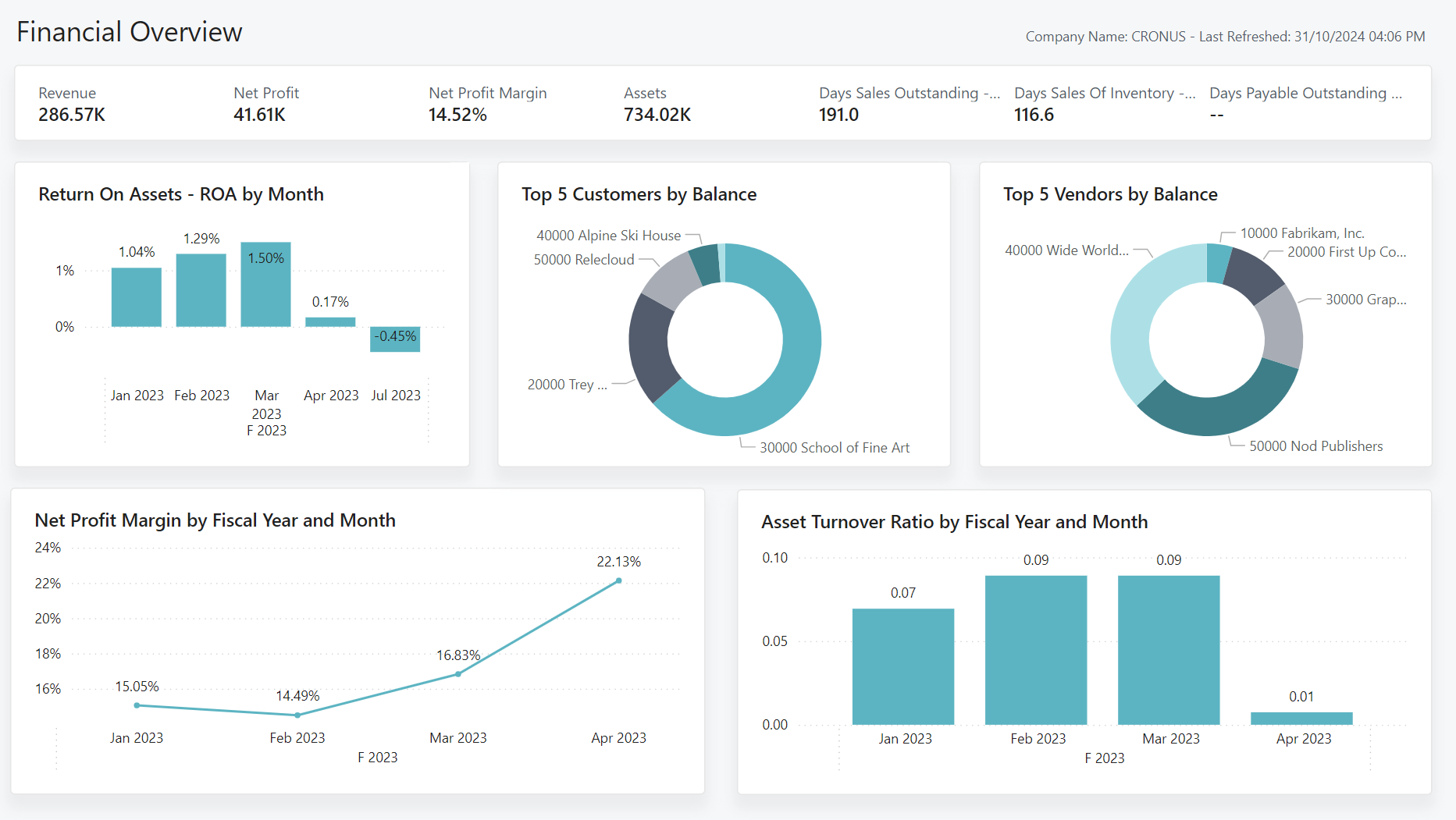
End-to-end design and implementation of an interactive Power BI dashboard for executive financial reporting.
To modernize the client’s financial reporting, I led the transformation from fragmented Excel spreadsheets into a centralized Power BI solution. The goal was to eliminate manual processes, enable interactive drill-downs, and deliver reliable, timely insights for executive decision-making.
Objectives
- Automate data ingestion from the ERP to reduce manual Excel work.
- Enable granular drill-downs for department-level analysis of budget variances.
My role
- End-to-end project ownership: requirements gathering, data modeling, and dashboard design.
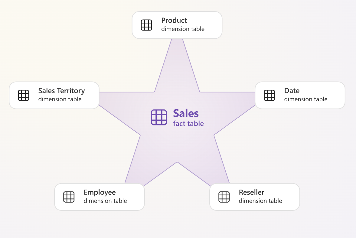
- Built a Star Schema data model integrating multiple data sources.
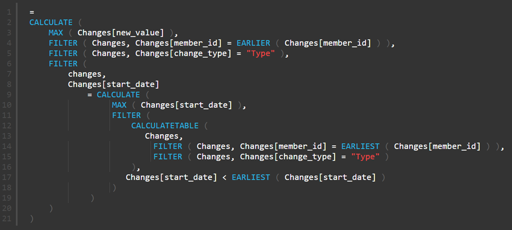
- Developed advanced DAX measures and crafted the UX for efficient navigation.
Tech Stack
| Platform | Microsoft Power BI |
|---|---|
| Backend | SQL, Power Query |
| Modeling | DAX (Data Analysis Expressions) |
| Design | Figma (Prototyping) |
Report Architecture
The solution is structured into distinct navigational areas:
01_Executive_CockpitHigh-level KPI cards & trends02_PnL_Deep_DiveIncome statement matrix & waterfall03_Cash_Flow_DynamicsLiquidity & Opex analysis04_Geo_PerformanceSales distribution maps
The Challenge: From Fragmented Files to One Truth
The client previously relied on multiple Excel exports merged manually, causing:
- Data latency: reports available ~10 days after month-end
- Inconsistency: conflicting metrics across departments
- Limited interactivity: static reports prevented root-cause analysis
The main technical challenge was designing a data model to handle mixed granularities: quarterly budget vs. daily transactional actuals.

Methodology & Implementation
Following Kimball methodology, the solution included:
- ETL & Staging: Power Query cleaned inconsistent taxonomy and unpivoted legacy files.
- Data Modeling: Star Schema with central Fact Table (General Ledger) and conformed Dimensions (Calendar, Cost Center, Customer).
- DAX Engineering: Calculation groups enabled dynamic “Month-to-Date”, “Year-to-Date”, and “Same-Period-Last-Year” views.
- UI/UX Design: Grid-based layout with sidebar navigation for clarity and dark mode aesthetics.


Results: actionable insights
The dashboard became the primary tool for the Board of Directors, shifting the finance team from manual data gathering to strategic analysis.
- Reporting latency: reduced from ~10 days to [INSERT METRIC]
- Decision-making: executives access real-time KPIs and drill-downs
- Data quality: consistent metrics across departments
Note: To maintain confidentiality, all company names, locations, dates, and specific proprietary values have been anonymized or modified. The analysis focuses on the technical methodology and challenges encountered during the project.