Matplotlib#

Matplotlib is a powerful Python library for creating a wide variety of data visualizations. Its key features include support for diverse plot types, extensive customization options, the ability to generate publication-quality graphics, extensibility, integration with NumPy, and interactive capabilities. It supports multiple output formats, has a large user community, and is open source. Matplotlib is an essential tool for data visualization and exploration.
import matplotlib.pyplot as plt
Plot#
import numpy as np
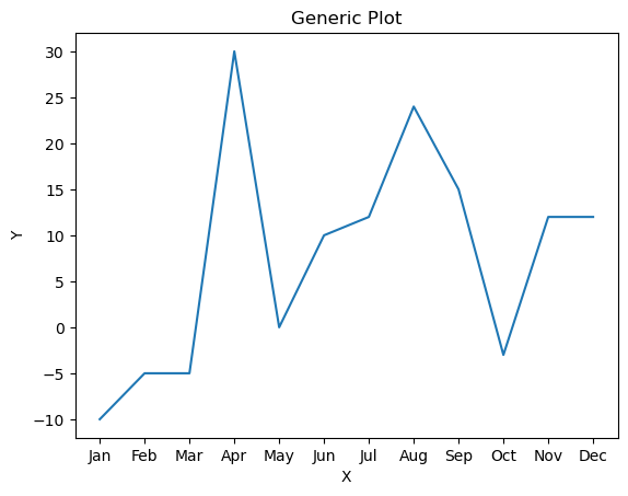
xpoints = ['Jan', 'Feb', 'Mar', 'Apr', 'May', 'Jun', 'Jul', 'Aug', 'Sep', 'Oct', 'Nov', 'Dec']
ypoints = np.array([-10, -5, -5, 30, 0, 10, 12, 24, 15, -3, 12, 12])
plt.plot(xpoints, ypoints) # generic plot
# Title
plt.title('Generic Plot')
# Labels on the Axes
plt.xlabel('X')
plt.ylabel('Y')
# Grid
# plt.grid()
# Legend
# plt.legend()
plt.show()
plt.plot
It’s a fundamental tool for creating line plots, a key component in data visualization using the Matplotlib library. Its primary purpose is to visually represent relationships between variables or display trends in data through the use of points connected by lines.
x: data on the x-axe
y: data on the y-axe
scalex (default = True): indicating whether the x-axe should be scaled based on the data
scaley (default = True): indicating whether the y-axe should be scaled based on the data
data: optional object that can provide the data; if specified, the x and y, and other data-requiring arguments, can refer to columns of this object
label: provides a descriptive label for the line or marker in the plot
linestyle or ls: determines the style of the line
‘-’ (default): solid line
‘:’: dotted line
‘–’: dashed line
‘-.’: dashed-dotted line
‘’: none
linewidth or lw: determines the width of the line
color: determines the color of the line
marker: specifies the type of markers used to highlight data points on the line
‘o’: circle marker
markersize or ms: specifies the colors of the markers
markerfacecolor or mfc: sets the color inside the edge of the markers
markeredgecolor or mec: sets the color of the edge of the markers
Subplots#
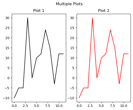
Subplots in the context of data visualization, particularly in libraries like Matplotlib in Python, refer to individual plots or charts that are organized within a larger, overarching figure. These subplots enable the simultaneous display of multiple graphs, allowing for a more comprehensive exploration of different aspects of the data. In essence, subplots provide a structured and organized way to present diverse information in a unified visual space. They facilitate the side-by-side comparison of various visualizations, enhancing the overall clarity and interpretability of the data being presented.
The creation of subplots is commonly achieved using the subplots function, which establishes a grid of smaller plots within a single figure. Each subplot acts as an independent canvas for representing specific datasets, trends, or comparisons, contributing to a more detailed and nuanced visual narrative.
plt.subplot(1, 2, 1)
plt.plot(ypoints, color = 'black')
plt.title('Plot 1')

plt.subplot(1, 2, 2)
plt.plot(ypoints, color = 'red')
plt.title('Plot 2')

plt.suptitle('Multiple Plots')
plt.show()
Plot Types#
Scatterplot#
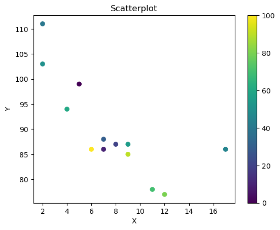
An scatterplot is a graphical representation of data points in a two-dimensional space, typically using Cartesian coordinates. Each point on the plot corresponds to the values of two variables, one plotted on the horizontal axis (X-axis) and the other on the vertical axis (Y-axis). The positioning of the points reveals any patterns, relationships, or trends that may exist between the variables. Scatterplots are commonly used in statistical analysis and data visualization to visually assess the correlation or association between two variables. They help identify the presence of outliers, clusters, or any other distinctive patterns within the data. The visual nature of scatterplots makes them effective tools for gaining insights into the nature of the relationship between variables, aiding researchers, analysts, and decision-makers in understanding and interpreting the data.
x = np.array([5, 7, 8, 7, 2, 17, 2, 9, 4, 11, 12, 9, 6])
y = np.array([99, 86, 87, 88, 111, 86, 103, 87, 94, 78, 77, 85, 86])
colors = np.array([0, 10, 20, 30, 40, 45, 50, 55, 60, 70, 80, 90, 100])

plt.scatter(x, y, c=colors, cmap='viridis')
plt.colorbar()

plt.title('Scatterplot')
plt.xlabel('X')
plt.ylabel('Y')

plt.show()
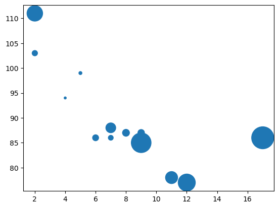
sizes = np.array([20, 50, 100, 200, 500, 1000, 60, 90, 10, 300, 600, 800, 75])

plt.scatter(x, y, s=sizes)

plt.show()
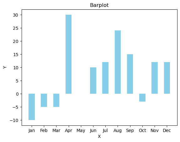
Bar Plot#
A bar plot is a graphical representation of data where rectangular bars of equal width are drawn to represent the values of different categories or groups. The length of each bar corresponds to the magnitude or frequency of the data it represents. Bar plots are commonly used to compare the values of individual categories or groups, emphasizing the differences between them. Bar plots are particularly useful when dealing with categorical data or when comparing discrete groups. They provide a straightforward visual tool for illustrating the distribution, comparison, or relationships between different categories, making them valuable in both exploratory data analysis and presentation of results.
plt.bar(xpoints, ypoints, color='skyblue', width = 0.5)

plt.title('Barplot')
plt.xlabel('X')
plt.ylabel('Y')

plt.show()
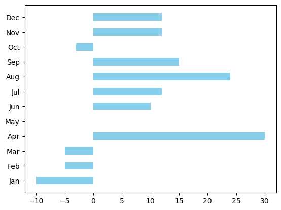
plt.barh(xpoints, ypoints, color='skyblue', height = 0.5)

plt.show()
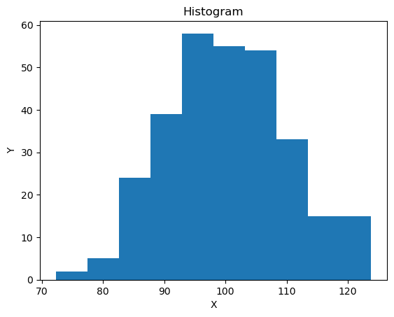
Histogram#
An histogram is a graphical representation of the distribution of a dataset. It consists of a series of contiguous rectangular bars, where each bar represents a specific range or interval of values, and the height of the bar corresponds to the frequency or count of data points falling within that range. Unlike a bar plot, which is used for categorical data, histograms are primarily employed for visualizing the distribution of continuous numerical data. Histograms are useful in providing insights into the shape, central tendency, and spread of a dataset. They help identify patterns, clusters, and outliers within the data. By dividing the data into intervals and representing the frequency of observations in each interval, histograms allow for a visual assessment of the data’s underlying structure. They are commonly used in statistical analysis, exploratory data analysis, and data visualization to better understand the characteristics of a dataset and make informed decisions based on its distribution.
np.random.seed(0)
x = np.random.normal(100, 10, 300)
plt.hist(x)

plt.title('Histogram')
plt.xlabel('X')
plt.ylabel('Y')

plt.show()
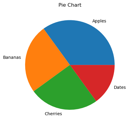
Pie Chart#
A pie chart is a circular statistical graphic that is divided into slices to illustrate numerical proportions. In a pie chart, each slice represents a proportionate part of the whole, and the size of each slice is determined by the value it represents relative to the total. The entire circle represents 100% of the data. Pie charts are commonly used to display the composition or distribution of a categorical dataset. They are effective for conveying the relative sizes of different categories within a whole and are particularly useful when the emphasis is on the contribution of each category to the total. Pie charts are often employed in business reports, presentations, and other contexts where a quick and intuitive representation of proportional relationships is needed.
val = np.array([35, 25, 25, 15])
lab = ['Apples', 'Bananas', 'Cherries', 'Dates']

plt.pie(val, labels = lab)

plt.title('Pie Chart')

plt.show()
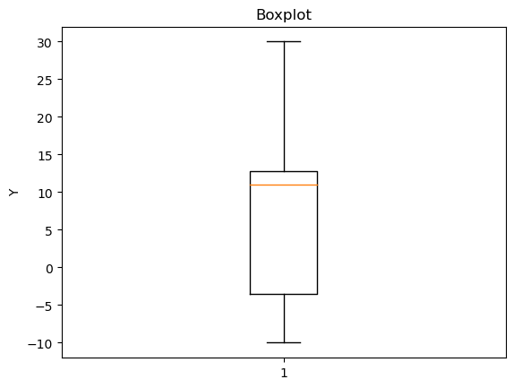
Boxplot#
A boxplot, also known as a box-and-whisker plot, is a statistical graphic that provides a visual summary of the distribution of a dataset. It displays key characteristics such as the minimum, first quartile (Q1), median, third quartile (Q3), and maximum values. The plot consists of a rectangular “box” that spans the interquartile range (IQR) — the range between the first and third quartiles — and “whiskers” that extend from the box to the minimum and maximum values. Boxplots are particularly useful for identifying the central tendency, spread, and potential outliers in a dataset. They allow for a quick visual comparison of the distribution of different groups or datasets, making them valuable tools in exploratory data analysis and statistical reporting.
plt.boxplot(ypoints)

plt.title('Boxplot')
plt.ylabel('Y')

plt.show()
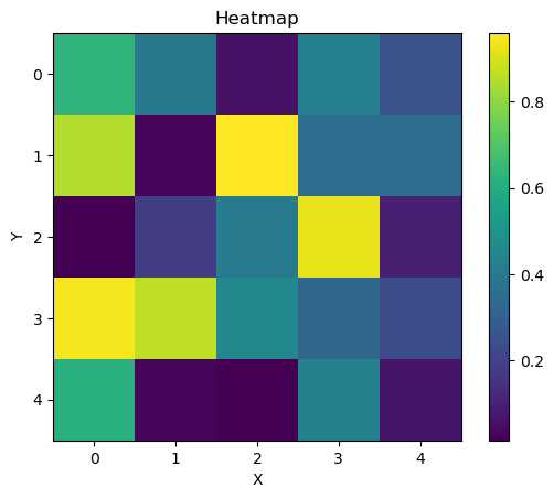
Heatmap#
A heatmap is a graphical representation of data where values in a matrix are represented as colors. Typically, a two-dimensional grid of cells represents the data, and each cell’s color intensity reflects the magnitude of the corresponding value. Heatmaps are commonly used to visualize complex datasets, especially those with multiple variables or dimensions. Heatmaps are valuable for revealing patterns, trends, and relationships within the data. They are often employed in data analysis, biology, finance, and other fields to explore and understand the structure and interdependencies of variables. Heatmaps can highlight clusters, correlations, or areas of high and low activity, providing an intuitive and visually rich representation of information.
data = np.random.random((5, 5))

plt.imshow(data, cmap='viridis', interpolation='nearest')
plt.colorbar()

plt.title('Heatmap')
plt.xlabel('X')
plt.ylabel('Y')

plt.show()
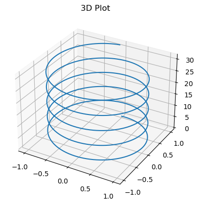
3D Plot#
A 3D plot is a graphical representation of data in a three-dimensional space, typically using three axes: the x-axis, y-axis, and z-axis. Unlike traditional 2D plots that display data in a plane, 3D plots provide a way to visualize relationships among three variables. The visual representation includes points, lines, surfaces, or other geometric shapes that convey information about the dataset’s structure. 3D plots are used when there is a need to explore and understand relationships or trends involving three variables simultaneously. They are commonly employed in fields such as mathematics, physics, engineering, and computer graphics, where three-dimensional representations can offer a more comprehensive view of the data.
from mpl_toolkits.mplot3d import Axes3D

z = np.arange(0, 10*np.pi, np.pi/50)
x = np.sin(z)
y = np.cos(z)

fig = plt.figure()
ax = fig.add_subplot(111, projection='3d')
ax.plot(x, y, z)
ax.set_title('3D Plot')

plt.show()
Color Palette#
import matplotlib.colors as mcolors

# Get a list of 10 distinct colors from the 'tab10' colormap
colors = plt.cm.tab10.colors[:10]

# Display the color palette with color names
plt.figure(figsize=(12, 1))
plt.xticks([])
plt.yticks([])
for i, color in enumerate(colors):
    plt.fill_between([i, i + 1], 0, 1, color=color)
    plt.text(i + 0.5, 0.5, mcolors.to_hex(color).upper(), color='black',
             ha='center', va='center', fontsize=8)

plt.show()